Monday, June 22, 2015

Essentials by Ellen June Pin-Sights Challenge

I had to play along with the Essentials by Ellen June Pin-Sights Challenge, just look at this fabulous, colorful inspiration board!


I used the picture of the colorful balls (above the pencils) as the springboard for my card.


I don't have very many Essentials by Ellen products yet, but I was inspired by Megan's card using the center of the Mondo Magnolia die and decided to use that to cut lots of pieces of colorful card stock.  The sentiment is also from Mondo Magnolia.  After I'd glued down all the pieces onto some dark grey card stock I decided it really needed something extra, so I threw some gold sequins on my card and glued them where they landed lol!  This was the perfect finishing touch.  Hope you enjoy my card, it's a little wacky, but very FUN :)

Thanks so much for stopping by today!


Sunday, June 21, 2015

The Gossip Column #3


I made a card today for The Gossip Column with Taheerah Atchia No. 3 / Interview with an A-Lister.  The A-Lister is none other than the FABULOUS Jocelyn Olson!  I've been a fan of Jocelyn for a long time and was delighted to learn more about her and have the opportunity to case her wonderful style!


Not sure how well I captured Jocelyn's style but it sure was fun trying ;)  My card started off with the white piece with the stenciled chevron down the side.  This was leftover from a card I made a few days ago and I didn't want it to go to waste.  I loved Jocelyn's "congrats, you rock" card over on the Winnie & Walter blog and that was my inspiration piece.  I love how she die cut the word "congrats" and let the red paper show through from underneath, so I decided to do that with the flower from In Bloom: Maggie's Roses Cutaways.  I also loved the layers of paper Jocelyn used so I made sure to include several layers on my card.  I cut the red patterned paper with the large scalloped frame from Essentials: Audrey Cutaways.  The little row of hearts under the word hope are also from Audrey Cutaways.  After I die cut the word hope and the leaves I used some Tumbled Glass distress ink and sponged the color on to match the color on the chevron.  To finish the card I added a few yellow sequins and tiny white hearts, which I put a little glossy accent on.

This was such a fun challenge!  If you'd like to try your hand at "channeling your inner Jocelyn", head on over to the Winnie & Walter blog to join in the fun!


MFT Summer School #5

Hello, and Happy Father's Day to all of the wonderful father's out there!  I'm back today with my 5th and last post for this segment of My Favorite Thing's Summer School!  This lesson is about quiet/white space on your cards.  This is one of my favorite design principles, I always seem to gravitate towards cards with a lot of white space and a nice pop of colors/patterns in the focal image.  I think it really helps draw the eye right to the focal point, which is what we want, right?  Even though I've used very subtle colors on this card, they still pop because of all the white space surrounding them.


I first used MFT's large chevron stencil, and a dot stencil from Club Scrap, to sponge some ink onto my card.  The dies are from Blueprints 13 (the circles), and Blueprints 14 (the leaves), and the sentiment is from Cheerful Blessings.  I love this particular sentiment, it's the reason I bought this set!  I finished this very simple card with a few clear rhinestones from Pretty Pink Posh.

There will be more lessons later in the summer and I can't wait to see them!  Hope you'll stop back then :)

Friday, June 19, 2015

MFT Summer School #4

Back with My Favorite Thing's Summer School, lesson #4, Line.  For this card I decided to use Jumbo Abstract Art to make my "lines".


I stamped the large abstract stripe, slightly overlapping, using inks from Wplus9's Storybook collection to create a pastel rainbow.   I die cut the sun with Die-namics Sun, Moon, & Stars, and then stamped the sentiment from Cheerful Blessings with black ink.  Next I cut several extra suns from white card stock and stacked them to give dimension and make the sun pop, placing the sun with sentiment on top.  To finish this simple card I added a rainbow of Pretty Pink Posh sequins.

I'm having so much fun with these lessons, if you haven't checked them out you should.  The design team is offering really helpful lessons each day; I'm really learning a lot!

MFT Summer School Lesson #3

Happy Friday!  I'm back today with lesson #3 from My Favorite Things Summer School, Movement/Flow.  When I saw this lesson I knew exactly which die I wanted to use, the curvy dots from Die-namincs Sun, Moon, & Stars.  This dies gives wonderful movement to any card you use it on!


I die cut the dots twice, then cut along the curve of the top line of dots.  Then I used the stitched frame from Blueprint 13 to cut the piece and placed it on a powder blue card base.  The pretty flowers are Die-namics Gerbera Daisies (the leaves are from Winnie & Walter).  The sentiment is from Blue Skies Ahead, I curved it to fit in the space.  I finished my card with some tiny butterflies which I topped with some Wink of Stella to add a little sparkle.  I think I succeeded pretty well with this lesson, the curved lines and sentiment lead your eye to the pretty flowers, sure to "cheer up" anyone's day!

I'll be back shortly with lesson #4 :)


Wednesday, June 17, 2015

MFT Summer School Lesson #2

I'm back today with another card for My Favorite Thing's Summer School.  Today's lesson is about creating a focal point on your card.


I had a lot of fun creating this card!  For the background I used MFT's large chevron stencil.  First I inked up the stencil with some light grey ink then sprayed it with a fine mist of water.  I then pressed that to my paper; this created the grey speckles.  Then in the open spaces of the chevron stencil I used Broken China distress ink and a sponge to add the blue.  I die cut my paper with the large stitched die from Die-namics Blueprint 13.  To make the "vase" I cut a piece of white card stock and dotted vellum using part of an MFT flag die and then layered them together.  I think this looks a bit like a vase and worked well enough since I don't have any vase dies.  The flowers and leaves were die cut from Blueprint 14.  I only own 2 of the Blueprint die sets but I wish I owned them ALL, they're so versatile and wonderful to work with!!  I sponged the flowers with Squeezed Lemonade and Wild Honey distress inks, and the leaves with Cracked Pistachio.  The sentiment is from MFT's Blue Skies Ahead and the washi die cut it's stamped on is from Die-namics Washi Tape.

So there you have it, I think this card has a strong focal point and I love the way it turned out!  I'll be back tomorrow with lesson #3!  Thanks for stopping by!

Tuesday, June 16, 2015

MFT Summer School

Hello!  I'm back from vacation and ready to join in with some of the stampy fun going on out there on the internet!  I was bummed to have missed the Coffee Lovers Blog Hop because you know how I LOVE my coffee (and coffee stamps), but the rest of the summer looks pretty clear and I'm hoping to have plenty of PLAY time!

Today I have a card for My Favorite Things Summer School.  This looks like it's going to be lots of fun, and educational too.  I love learning new things and I'm hoping to play along with as many of the lessons as I can.  I don't have very many MFT stamps (not because I don't love them, but there's this little thing called a budget, BOO lol!), so I'm hoping to be lucky enough to win one of the prizes they'll be giving away so I can buy something from them.  Today's card does use all MFT supplies (except for the inks), and it's all about the rule of thirds.


Sorry for the slightly blurry picture, it's very cloudy here today and I was having trouble getting a clear shot.  Anyway, I used Blueprint 14 and Sun, Moon, & Stars Die-namics, and Blue Skies Ahead and Pinstripe stamps.  To make the striped background I inked up the stamp with 3 different shades of Distress Ink (Seedless Preserves, Salty Ocean, and Cracked Pistachio), then misted the stamp with water and stamped onto watercolor paper.  I thought that the contrast between the color and white was too harsh so I used a water brush to brush over the stripes, which spread some color but also kept the stripes intact.  For the sun I mixed various yellow DI's on some watercolor paper, then cut with the sun die.  I cut several suns and layered them together to add some dimension.  The sentiment is stamped with Salty Ocean DI.  I finished the card with some yellow and clear sequins. 

If you'd like to learn about "the rule of thirds", and play along, visit the MFT blog for all the details!

Thanks for stopping by today!

Monday, June 1, 2015

30 Day Coloring Challenge Day 1

Hello!  Have you heard about the 
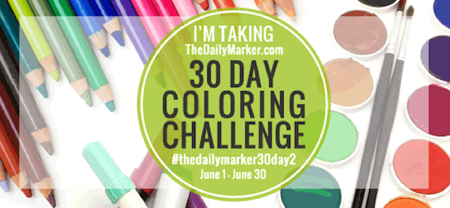
30 Day Color Challenge that Kathy of The Daily Marker is hosting?  She hosted one previously, this is actually the second one, and I didn't get to participate the first time and really wanted to try to this time around.  Kathy is an artist extraordinaire, her coloring skills are amazing, and she makes lots of videos teaching how she works her magic with paper and color.


I have to say up front, I pretty much suck at coloring lol!  I have my crafty "strengths", but coloring is not one of them.  For one thing, I've had shaky hands my entire life (it's a genetic thing), so that puts me at a disadvantage right off the bat.  I mean picture a drunken sailor with the DT's trying to color, and you get the picture ;)  Some coloring techniques are easier for me than others and I tend to stick with those.  For awhile I wouldn't even buy stamps that needed to be colored, I'd either buy solid stamps, or multi step stamps, or open images that could be paper pieced, because that I can do.  Recently though (and I think this probably has to do with the watercolor revolution that's taken place in the craft industry, because it's a more forgiving medium to work with), I've been buying more open images, and I'm determined to practice and get better at coloring.

Anyway, today's technique is coloring with Copics.  I played around with a Martha Stewart butterfly image for my card, and decided, based on the sentiment, to "color outside the lines" (obviously easier for me what with the shaky hands and all lol!)


Even if the butterfly itself doesn't look so good, I do like the finished card.  Butterflies are a pretty forgiving thing to color, you can take a lot of artistic license with them, so I guess it's all good :)

Thanks for dropping buy, have a great day!